Strategy
The supplement space is crowded with beige, copy-paste wellness brands. Ares knew this wasn't an option. It wanted to stand out and own the shelves.
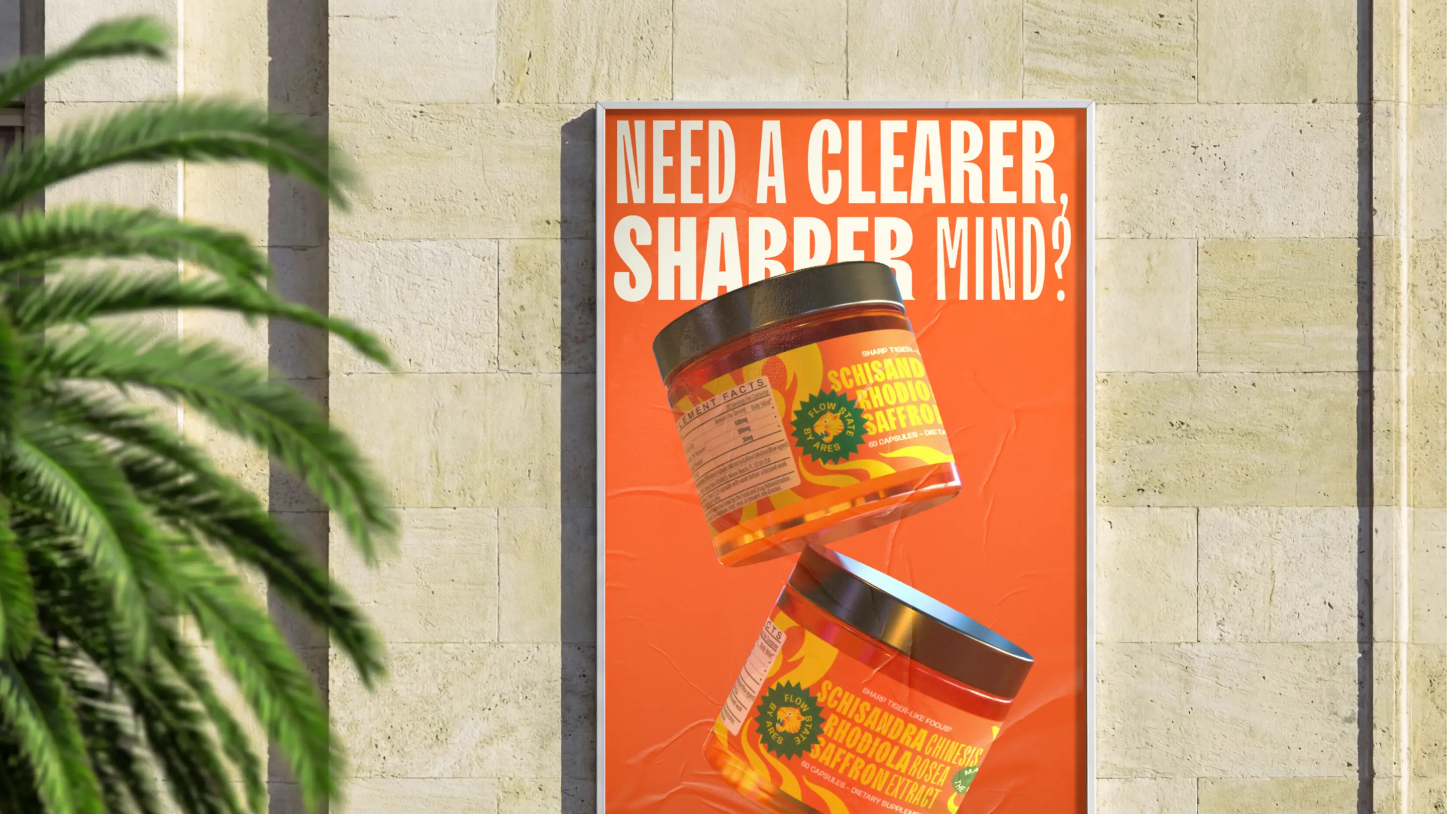
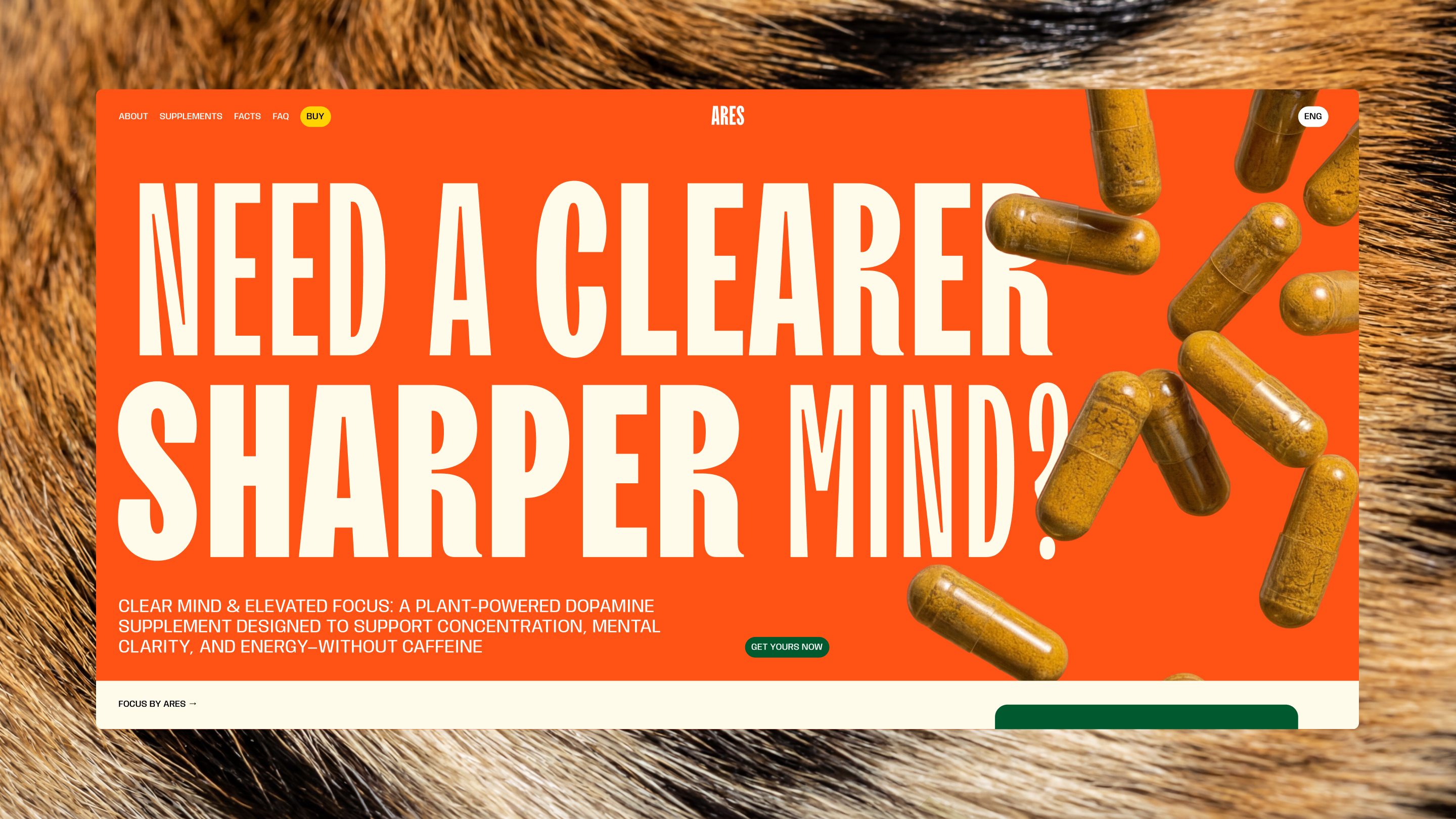
In a sea of muted, “natural” packaging, Ares needed to command attention – especially on platforms like Amazon and TikTok Shop. We positioned the brand around precision and power: natural ingredients, sharpened performance. Instead of leaning into soft wellness cues, we built Ares as a focused predator – designed deliver clarity without crash.
Execution
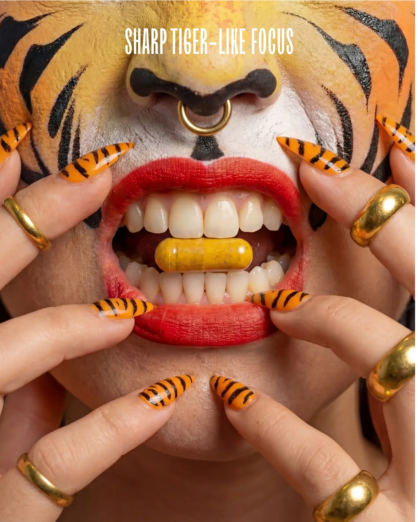
If focus had a visual form, would it blend in? We think it would strike. Sharp, fast, and impossible to ignore, cutting through with precision and intent.
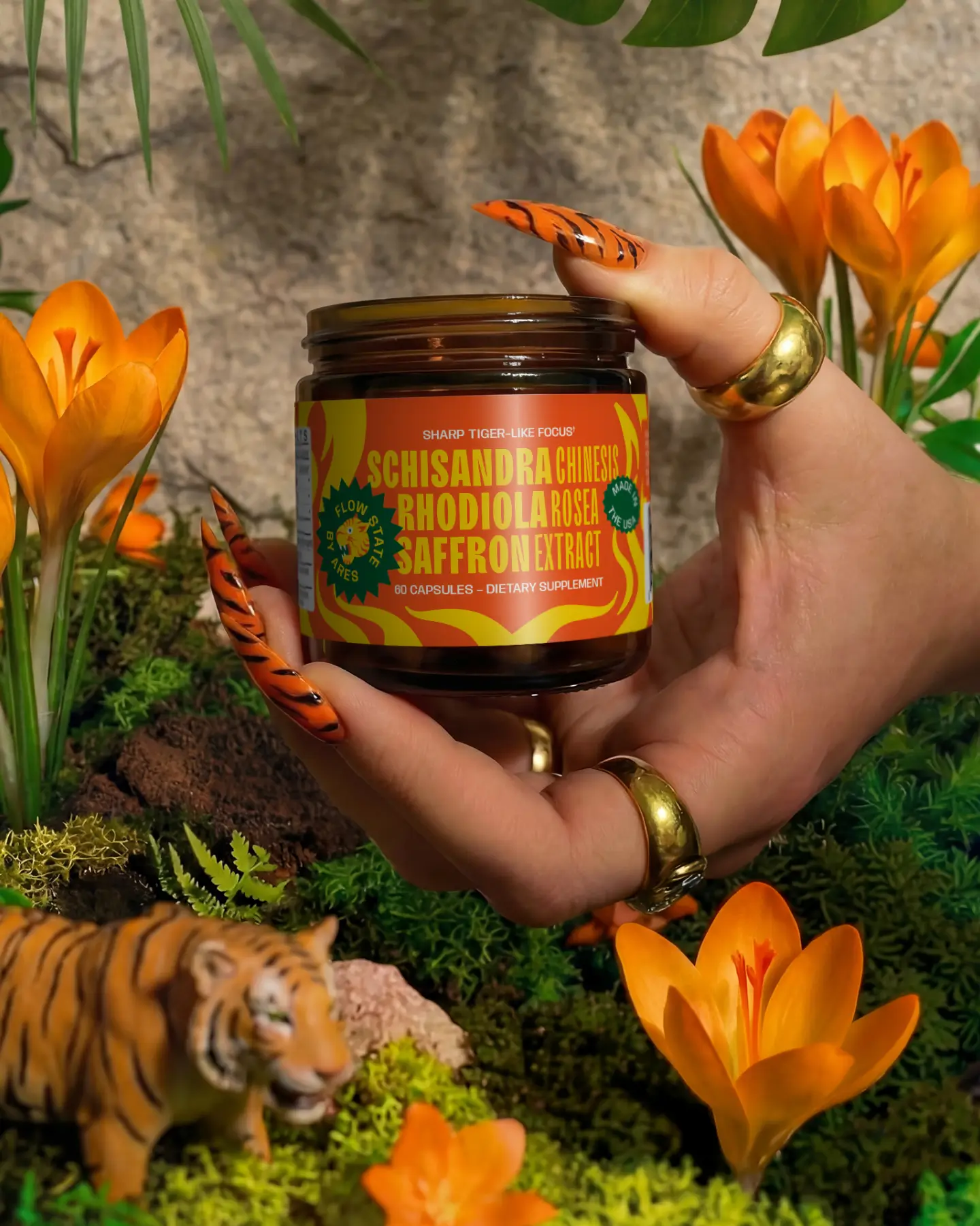
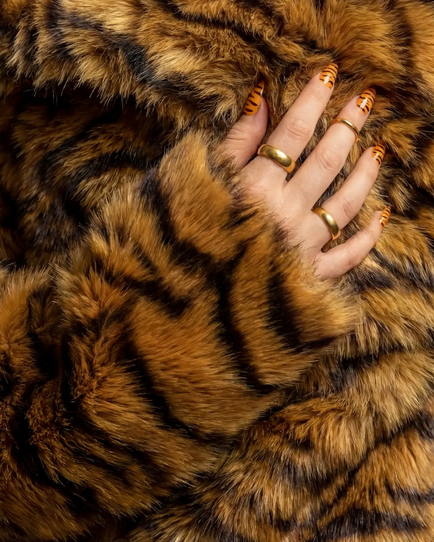
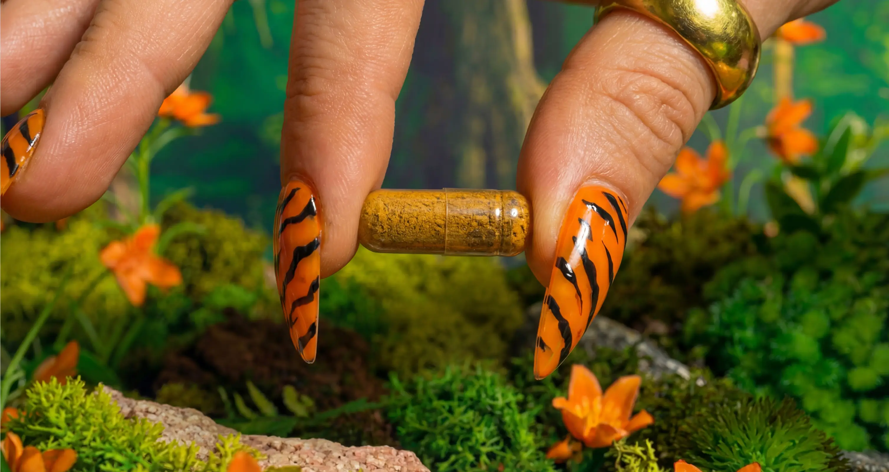
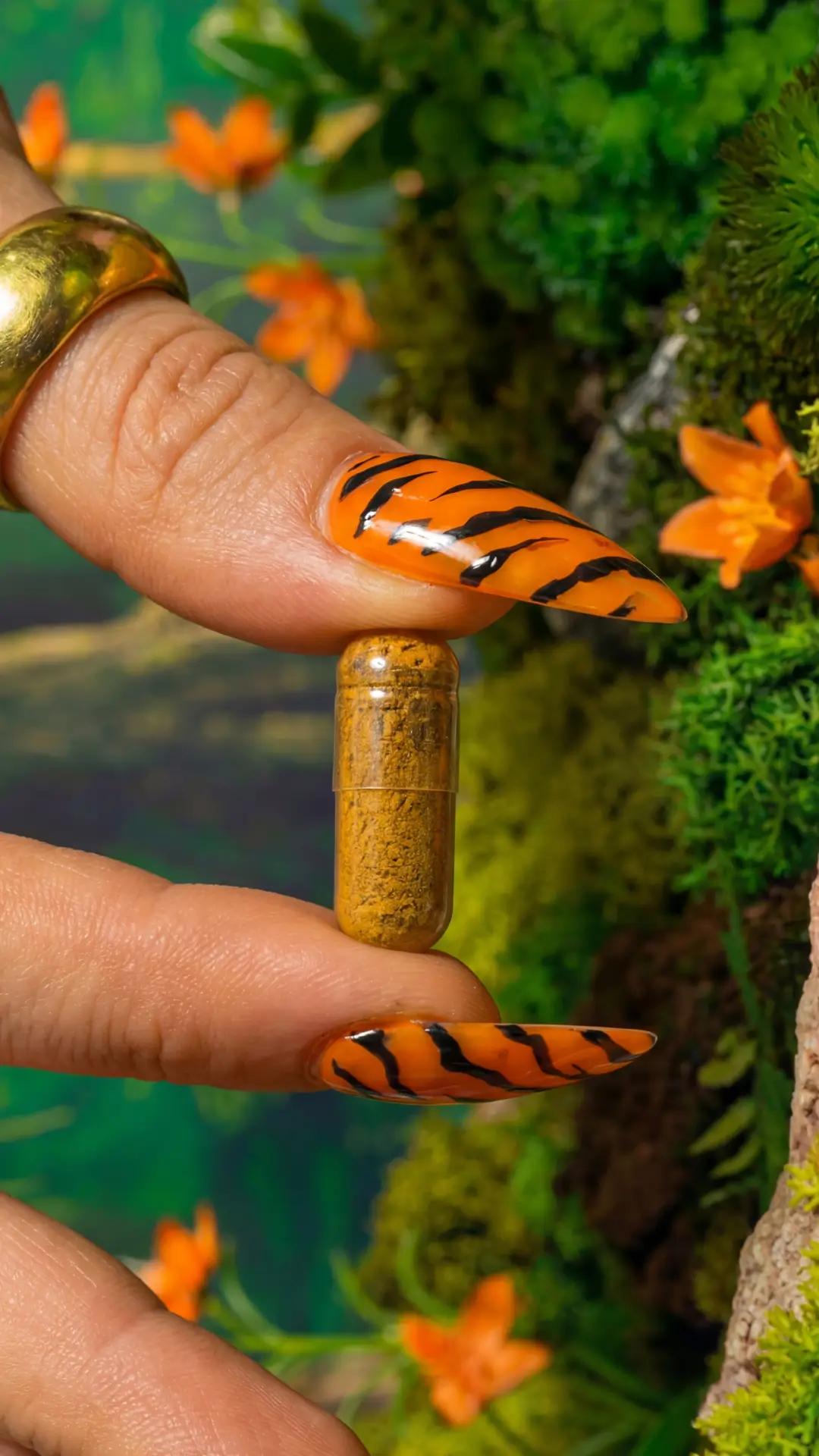
The identity revolves around a fiery tiger – sharp, alert, and not to mess with. Beyond symbolising precision and focus, the tiger nods to the brand’s Asian botanical roots, with ingredients like schisandra and saffron long associated with traditional Eastern practices. The bold colour palette breaks category norms, ensuring shelf impact in physical and digital marketplaces. The system balances intensity with clarity, engineered for scroll-stopping visibility in highly competitive environments.
Outcome and Credits
From day one, Ares converted standout branding into real traction and commercial results – driving immediate sales and gaining strong momentum.
Launched initially with a single SKU, Ares began generating sales immediately on Amazon and performed strongly on TikTok Shop. The bold visual identity proved critical in crowded digital environments, driving both clicks and conversion. By building a distinct brand around one focused product, Ares established a foundation strong enough to expand beyond its first formula – with visibility and velocity from the outset.
Credits
Cece – Brand Vision
Ala Ho – Strategy
Ania Martowska – Art Direction & Graphic Design