Strategy
When Sien came to us, the product was already loved – the challenge was the brand. With countless possible angles (nutritional, cultural, emotional), the story felt scattered.
To tell a cohesive story, we distilled everything into one defining insight: Lentils are understated, overlooked, and maybe even... a little unsure of themselves. (If a lentil came back as a person, she’d probably be a woman) So what if they stopped playing small? What if they owned their magic? What if they showed up, full force, exactly as they are? We think they’d be bold. Unapologetic. And maybe even a little sassy.
Execution
We built a brand world that leaned fully into that insight – loud, confident, and impossible to ignore.
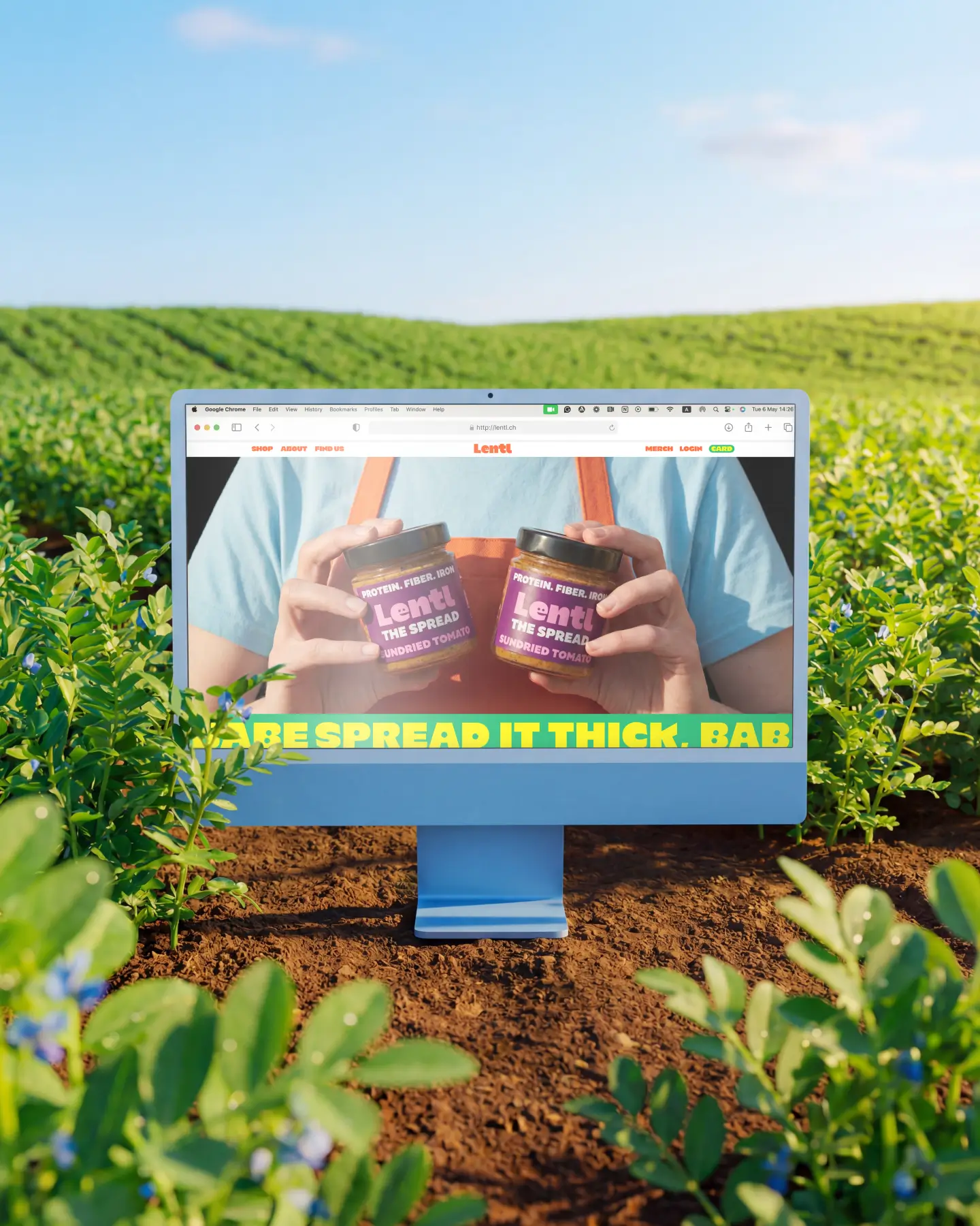
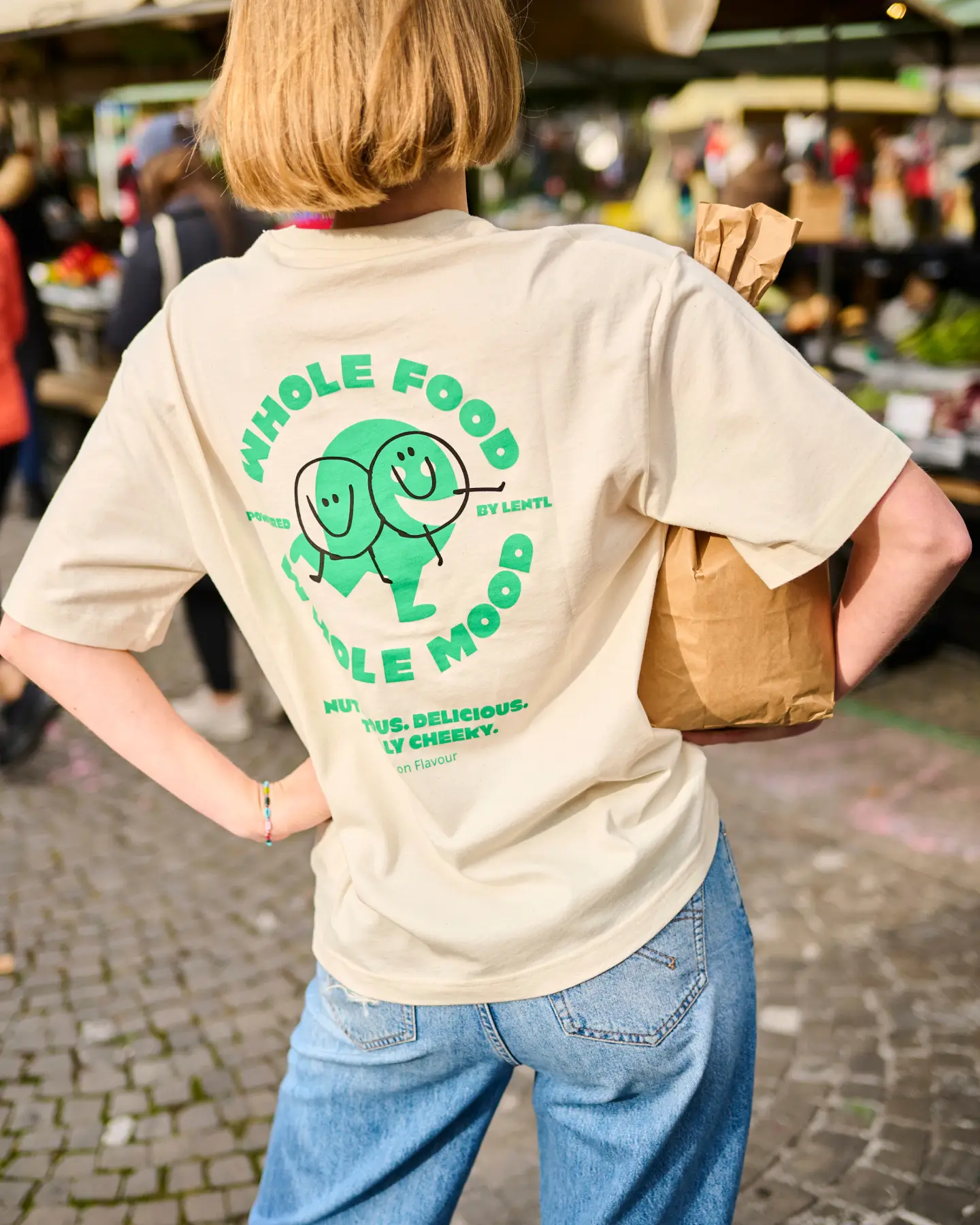
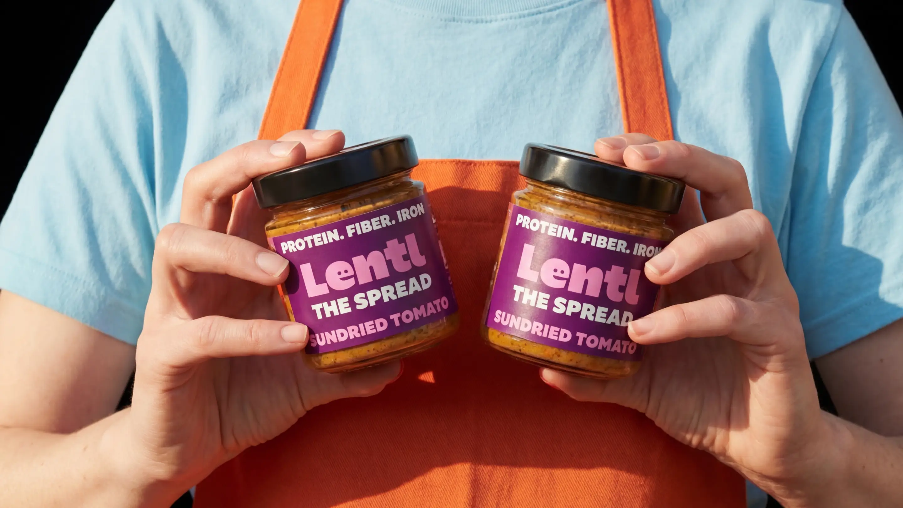
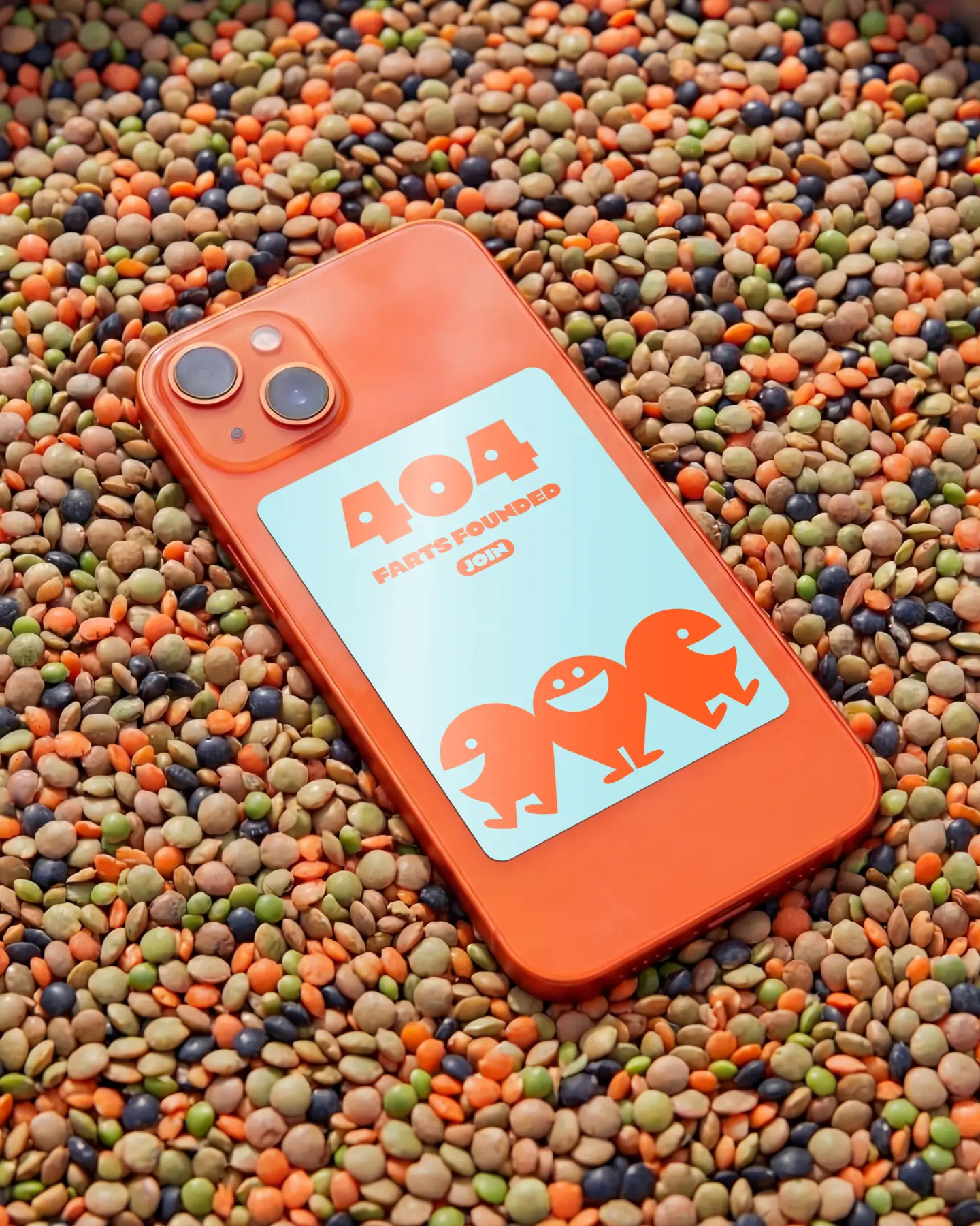
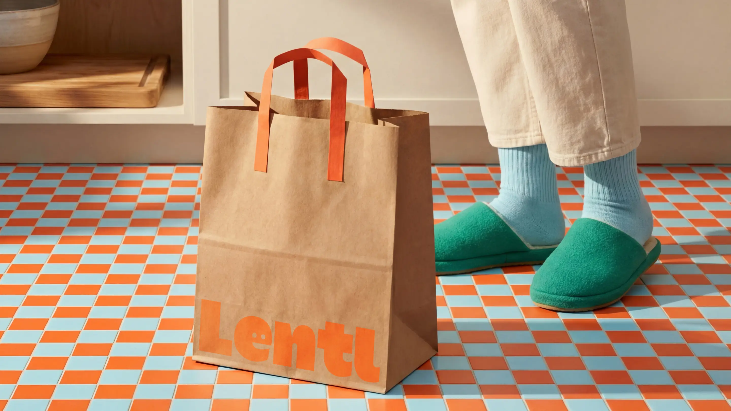
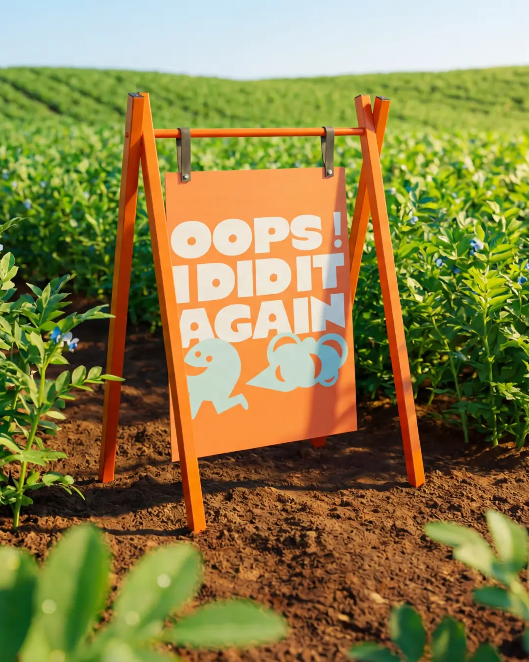
Enter Mr Lentil: a charmingly awkward, slightly tone-deaf brand character who tells the truth without apology. He brings levity to conversations around gut health, food systems, and eating well, balancing Sien’s thoughtful elegance. Visually, we embraced very bold colours, expressive typography, and unapologetic contrast, using design as a megaphone. From identity to packaging, every element was built to break category norms and feel unmistakably Lentl.
Outcome and Credits
Lentl evolved from a DIY brand into a platform with clarity, confidence, and room to grow.
A brand that doesn’t just look good but actively guides decisions – as Sien put it: “I see the brand as my ultimate mentor… it’s going to keep me on track.” Lentl now connects strategy and soul, intellect and irreverence – and most importantly – is built to grow into, not out of.
Credits
Sien Van Boven – Brand Vision
Kash Winek – PM & Strategic Insights
Ala Ho – Creative Director
Ania Martowska – Art Direction & Graphic Design
Thilo Müller – Photography