
Strategy
Call centers are associated with volume, pressure, and metrics – not clarity. We set out to reframe the category around understanding, not output.
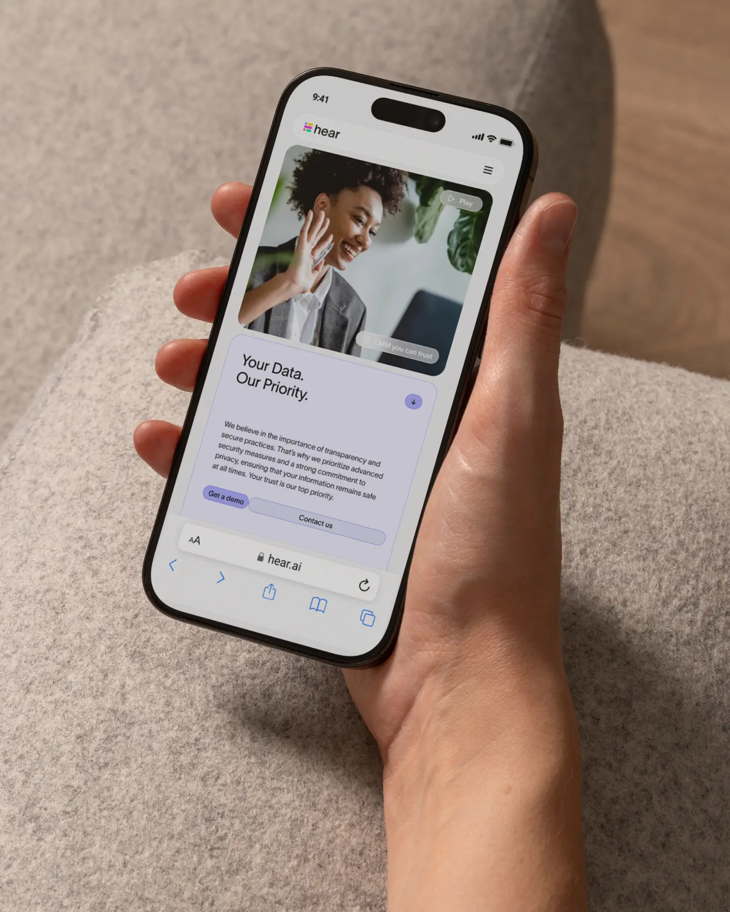
We built the brand strategy around a simple reframing: Hear doesn’t add more data, it reveals meaning behind the vast data you're already sitting on. Instead of speaking the language of dashboards and efficiency, we positioned Hear as clarity infrastructure. The concept “Simplify to Amplify” became the narrative anchor – expressing how reducing complexity unlocks better decisions, stronger leadership, and deeper human understanding.
Execution
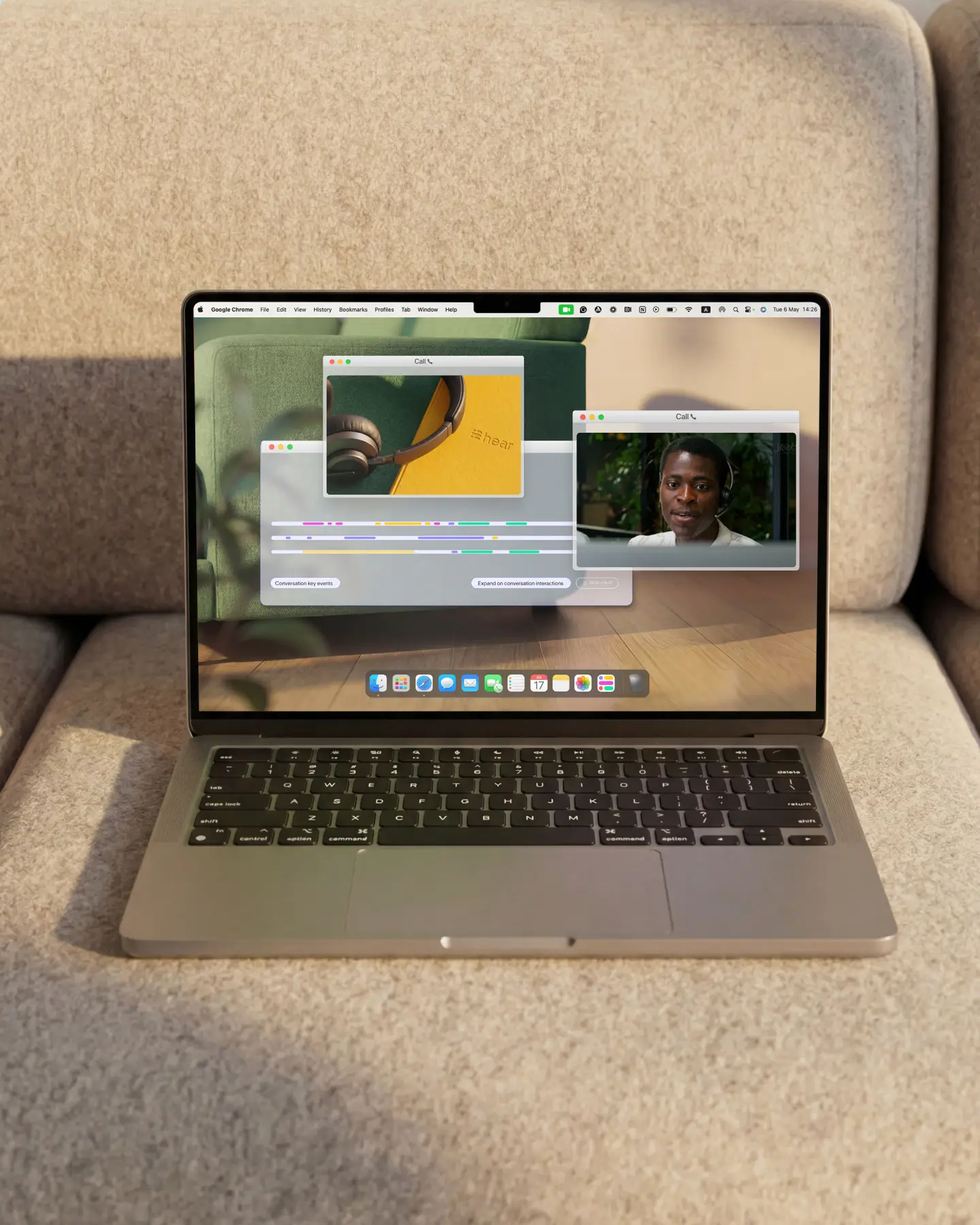
We drew inspiration from the product itself – the way Hear detects and connects key moments inside conversations, revealing patterns hidden in plain sight.
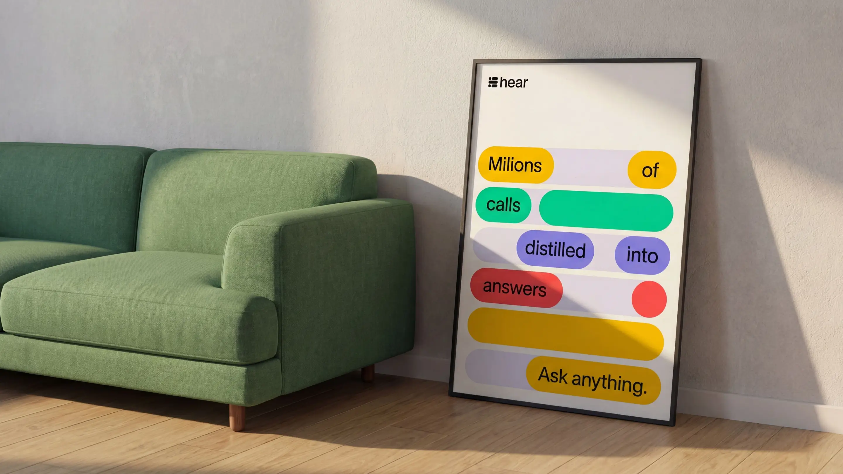
Hear visualises key moments in calls as “noodles” along a timeline – fluid signals emerging from conversational noise. We translated this directly into the brand system. Flowing lines became the central design motif, weaving through layouts and shaping the logotype itself. These visual threads symbolise connection, detection, and clarity – insight surfacing from complexity. The identity mirrors the product: structured, intelligent, and built to catch what matters most.
Outcome and Credits
Shortly after launch, Hear secured a $1M raise – while a targeted OOH campaign generated direct leads at a key industry conference.
The refreshed brand clarified Hear’s value at a pivotal growth stage. Shortly after launch, the company secured a $1M funding round, validating its positioning in the market. We also activated the brand through a targeted OOH campaign in strategic areas surrounding a major industry conference, driving direct inbound leads. Together, brand clarity and physical presence reinforced Hear’s authority and accelerated commercial momentum.
Credits
Noam Fine – Brand Vision
Maor Ofek (SIDE.ST) – Brand Strategy
Ala Ho – Creative Direction
Ania Martowska – Art Direction & Graphic Design
Patricia Falandysz – Web Development