Strategy
The category speaks in provocation and hyper-sexualisation. Jing needed to stand for something deeper – health, dignity, and meaningful connection.
Sexual health brands often rely on shock value or exaggerated masculinity. We repositioned Jing around a different truth: vitality is not about performance – it’s about balance, confidence, and connection. The strategy centred on breaking stigma, particularly for men. By aligning the brand with holistic health and emotional strength, Jing went beyond being a supplement, it became a catalyst for reframing the conversation.
Execution
Throught the identity, we wanted to honour traditional Chinese medicine while feeling contemporary, credible, and suitable for the modern lifestyle.
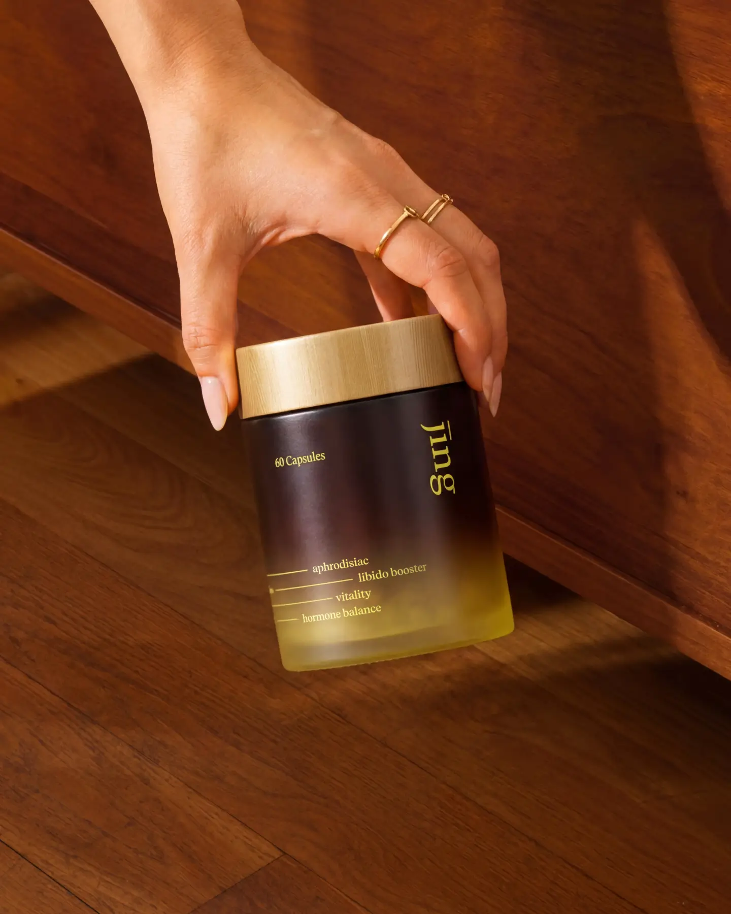
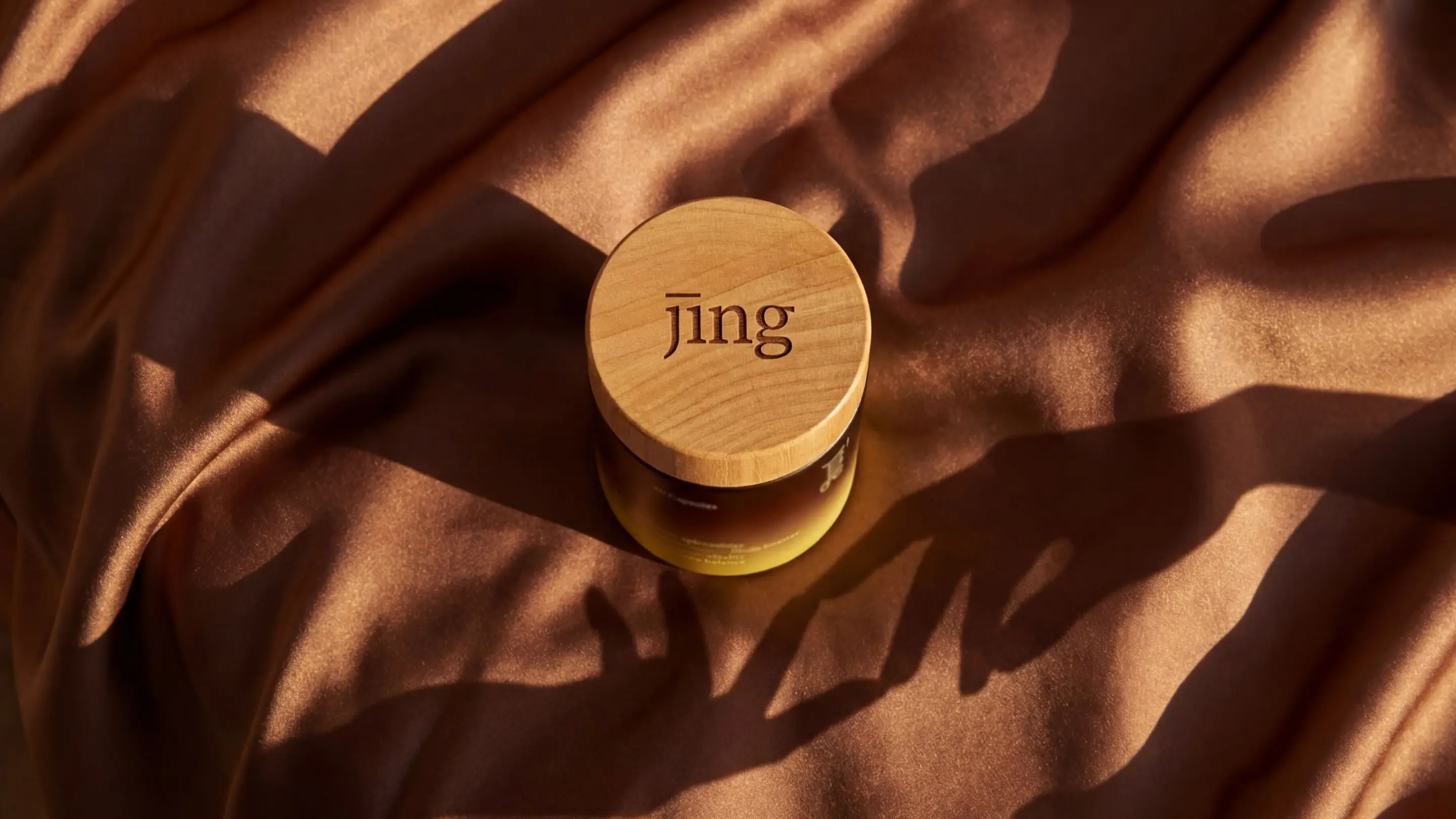
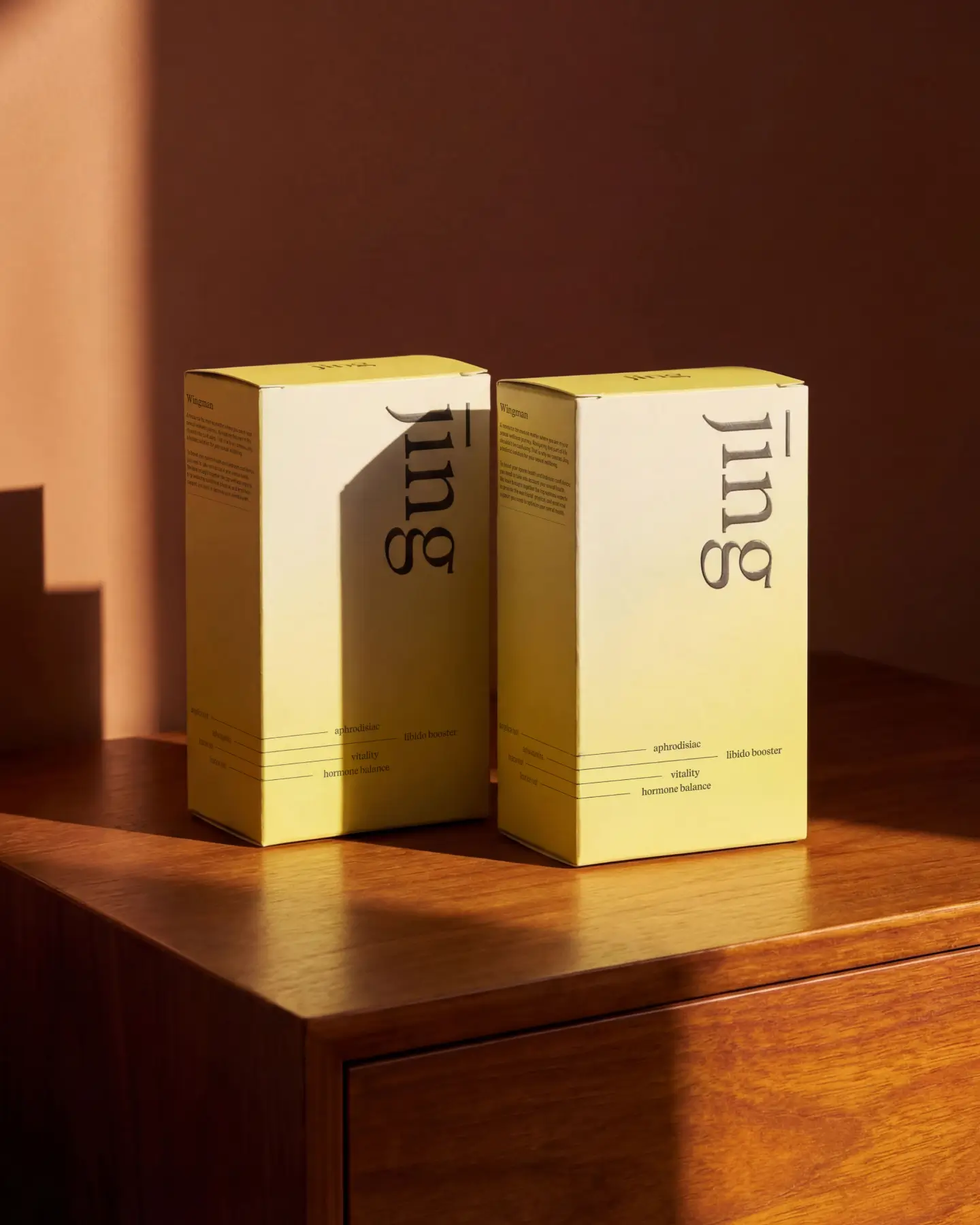
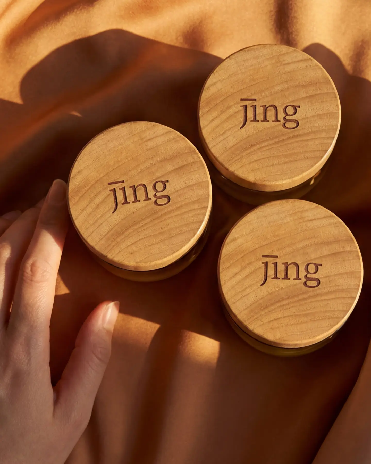
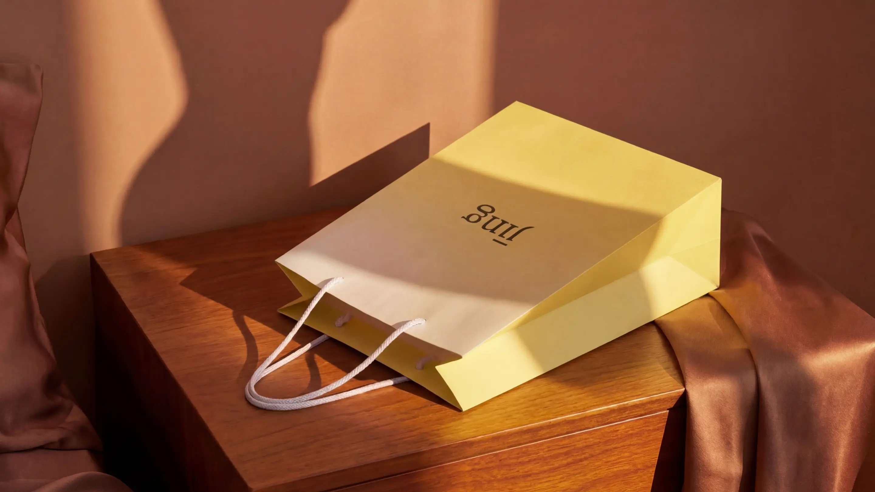
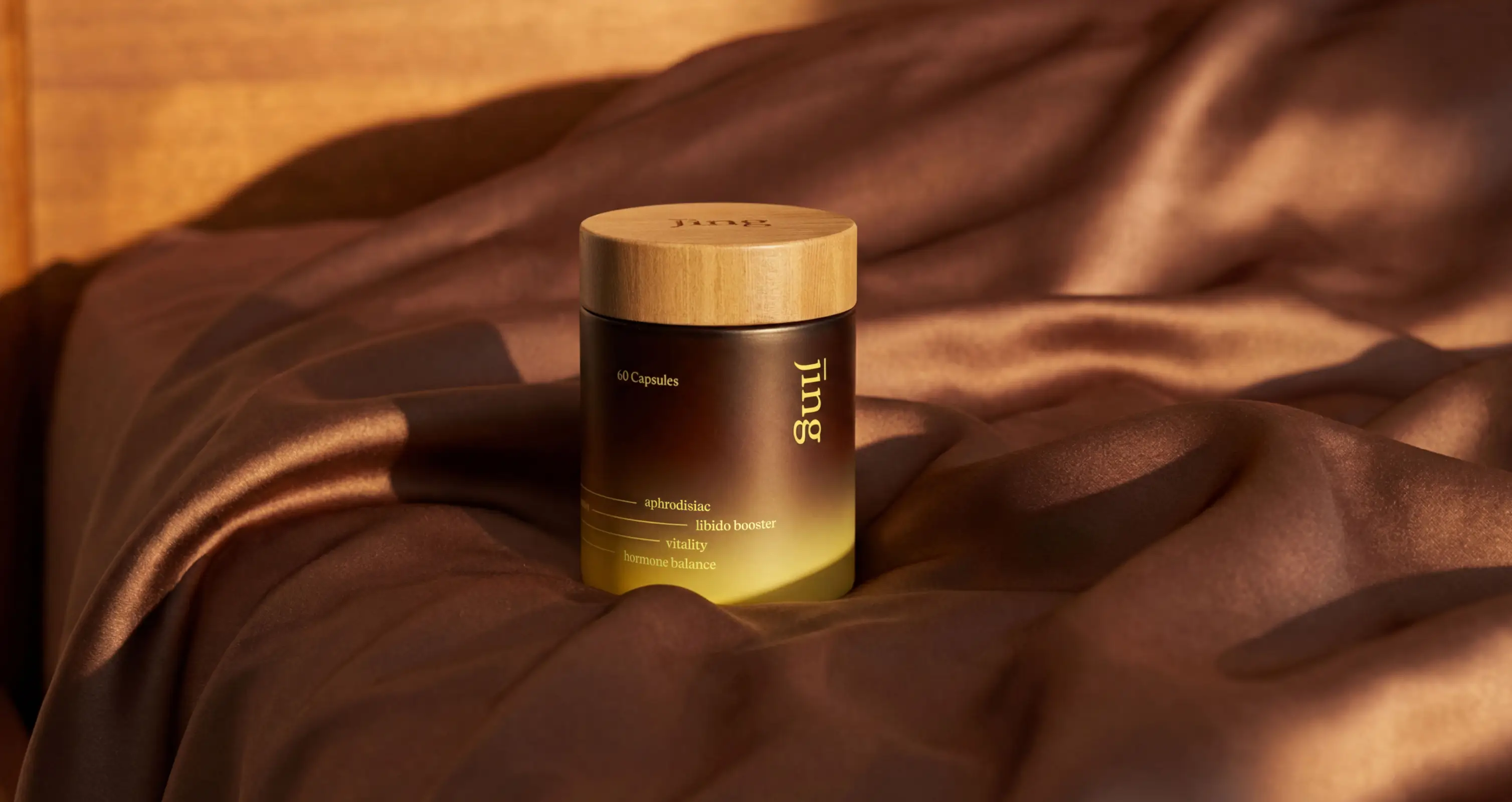
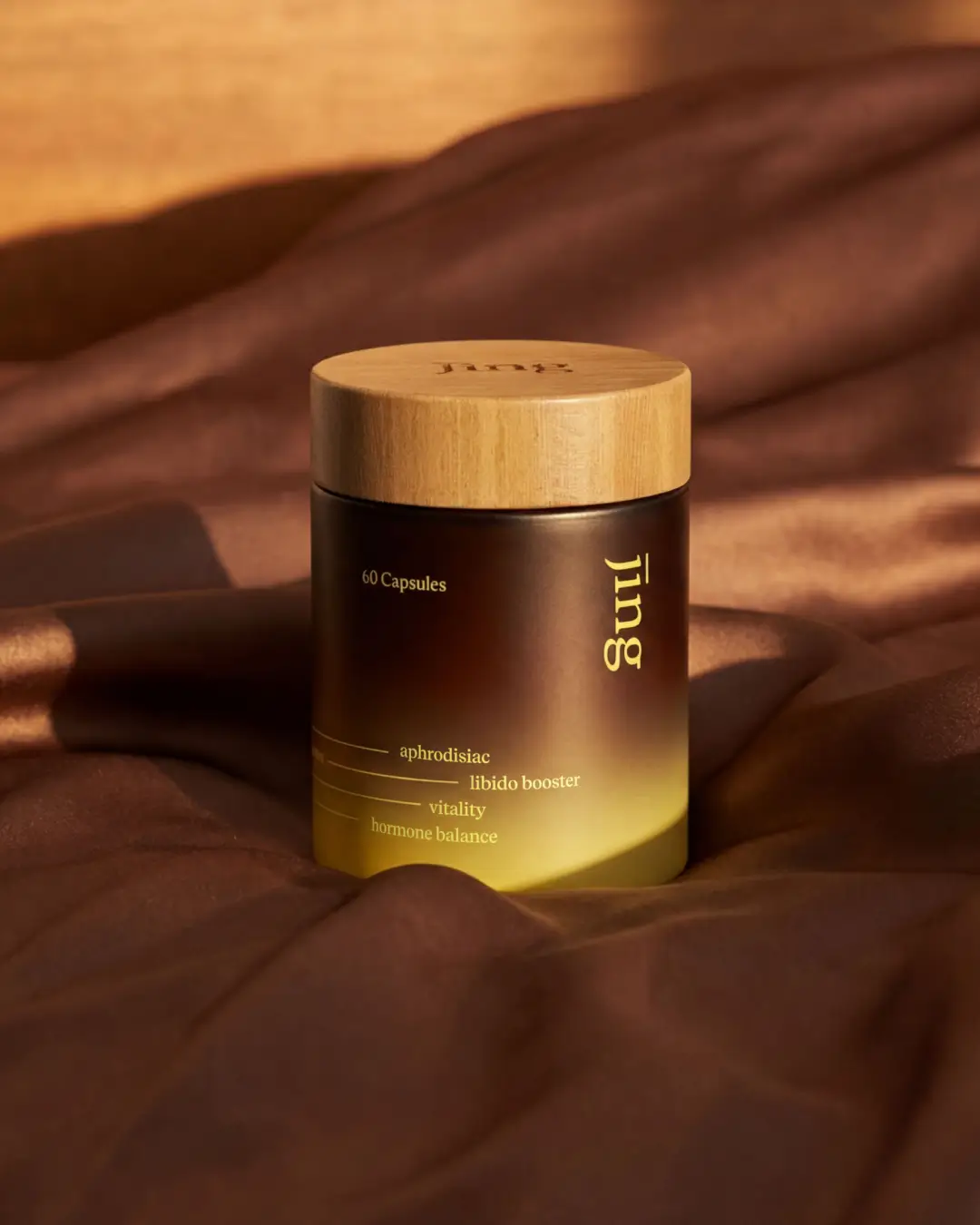
Visually, the brand merges heritage with modernity. Subtle references to traditional Chinese medicine ground the system in authenticity, while refined serif typography introduces a sense of establishment and trust. A continuous line element runs throughout the identity – symbolising steadiness, flow, and connection. The result is a visual language that feels rooted yet progressive, balancing cultural depth with contemporary clarity.
Outcome and Credits
Jing emerged with a brand that shifts perception – from shame to strength, from surface-level desire to meaningful vitality.
The rebrand positioned Jing as a thoughtful, human-first voice in a crowded market. By reframing sexual vitality through health and connection, the brand now communicates with clarity and dignity. What once risked being misunderstood now stands as a trusted space for empowerment – allowing people to feel supported, understood, and confident in taking ownership of their well-being.
Credits
Justine Mana – Strategy
Ala Ho – Creative Direction
Ania Martowska – Art Direction & Graphic Design
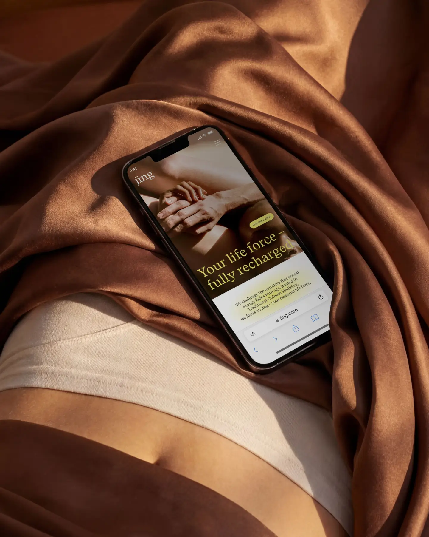
Ola Mia – Web Design